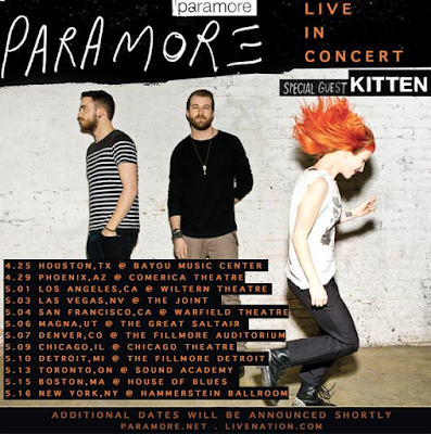
Main conventions of a tour poster can include:
- Dates and locations
- Group/artist name
- Name of tour
- Special guests
- Photo of group/Artist or image that relates to the genre/ tour theme
PARAMORE
 From this Paramore tour poster, I noticed that alongside this, many other posters contain a prominent image to convey what the concert will contain which also brands the artist/ bands. Paramore being a rock/alternative genre band, the dark colours used highlight this which is effective because their audience and me and a viewer notice straight away the type of music that their concerts will contain. The contrasts with the orange and black make them as a band stand out and reflect on the bold music they produce, we automatically get the vibe of them collectively through just looking at their tour poster and their edginess,
With our tour poster we want to include this basic look which instantly gets to the point which clearly states the dates and locations of the concert/gig. As the band have progressed from their earlier work (left to right) their style overall has changed as they have developed, however, their genre is still emphasised and included which is vital in marketing your band to either attract new people or to keep your current audience involved and engaged with also progressing and getting your point across.
Another thing I have noticed whilst researching into tour posters, is that the image used or colours, will often be consistent to the artists previous work, which over time, gain similar characteristics throughout their work, either developing or enhancing it as time goes by.
LORDE
FOSTER THE PEOPLE
Foster the people following their key aspect to branding themselves, illustrating, have brought this aspect into their tour poster, creating two inverted themed posters which compliment each other. This style of poster is a bit different to the 'mainstream' tour poster which normally has the dates and locations bolding visible, however, they have focused on a main Image to draw their target audience in, playing with the structure, which later reveals where the tour is and when it is, following basic conventions of what a tour poster includes. The use of the bold and washed out colours which compliment each other, highlight their indie genre with their creative and unique illustrations which brand them as a group.


No comments:
Post a Comment