Tuesday, 5 December 2017

Merch and research

From research, I have gathered the main points of how to create and sell merchandise successfully:
Things to consider:

  • Claim your brand name across different platforms (places to promote your brand to reach the most and ideal target audience)
  • Brainstorm ideas for possible items that would be successful/ appeal to your audience 
  • Be unique and original with your designs/items but also consider if the items will be useful/appropriate for an artist/band.
Common features of merch for an artist:
  • Includes some sort of design/logo representing the artist at first glance
  • Attracts to your target audience
  • follows your artists vibe/style
  • Includes basic items found across all merchandise e.g T-shirts, Bags, Badges, Jumpers, Mugs .etc.
  • It is often based on the artists website


For indie bands or artists just starting out, merch is often as simple as it looks often managed by their manager or themselves which can start out by being set up at a table outside similar bands or at their own gigs usually keeping the money for themselves of paying for venues. However, as you start getting bigger and bigger, tour mechanising companies will want a piece with tour merchandising companies being different from record label companies this can be difficult to deal with, with the company licensing the right to use your name and the merch you produce.


    For imagine dragons, in their website, on their tour page, they have a section dedicated to their 'Official merch' with this being permanent and which is for the tour specifically so that everyone attending the tour can be united, as well as branding them as a band.
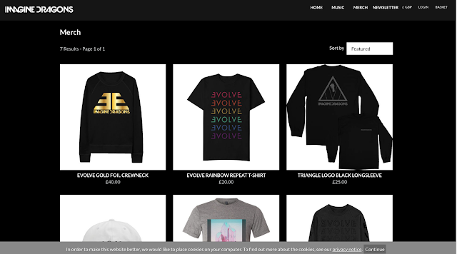


    They then have a specific page dedicated to their merch and the items that are more permanent, they follow the more general items that you would typically find of the merch of an artist.

“It’s about extending an artist’s brand through a global program of different consumer products. It's important to learn from other industries where they have tapped ideas around merchandising being a prominent marketing vehicle and being able to help build your brand,”

Tour poster

FINAL TOUR POSTER 


This being our final tour poster, we took our research into consideration and included the image of artist we think reflected Barde the most through her quirky and unique style to highlight and remind our target audience about the genre she reflects in her content. We made sure her name was clear and bold which is the main aspect of a tour poster and made sure the dates and locations were clear and brief. We went with a fairly simplistic look, not by our preference, but because we thought it reflected our artist with her raw and simplistic characteristic.

From this task and also the research behind what is included in a conventional tour poster is how to attract as well as brand your artist through simplistic skills and simple branding.

Tour poster reaseach

From this research, I gained to understand how different artists genres were represented through their tour poster and how certain artists/bands promote themselves with the use of colour, font, images ect.

Main conventions of a tour poster can include:

  • Dates and locations 
  • Group/artist name 
  • Name of tour 
  • Special guests 
  • Photo of group/Artist or image that relates to the genre/ tour theme

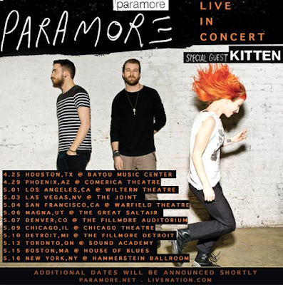
PARAMORE

From this Paramore tour poster, I noticed that alongside this, many other posters contain a prominent image to convey what the concert will contain which also brands the artist/ bands. Paramore being a rock/alternative genre band, the dark colours used highlight this which is effective because their audience and me and a viewer notice straight away the type of music that their concerts will contain. The contrasts with the orange and black make them as a band stand out and reflect on the bold music they produce, we automatically get the vibe of them collectively through just looking at their tour poster and their edginess,

With our tour poster we want to include this basic look which instantly gets to the point which clearly states the dates and locations of the concert/gig. As the band have progressed from their earlier work (left to right) their style overall has changed as they have developed, however, their genre is still emphasised and included which is vital in marketing your band to either attract new people or to keep your current audience involved and engaged with also progressing and getting your point across.


Another thing I have noticed whilst researching into tour posters, is that the image used or colours, will often be consistent to the artists previous work, which over time, gain similar characteristics throughout their work, either developing or enhancing it as time goes by.

LORDE


Lorde's music genre being described as being art pop, electropop and dream pop, are all highlighted and constructed well in just looking at her tour poster which consists of mainly black which is seen in her physical look of having dark lipsticks and primarily dark colours. The use of the bold, sharp font goes alongside of this electropop and her dark music, creating a sinister and dark tone to her as an artist which she is purposefully portraying. Again, the dates ad locations of the tour are placed on the bottom left hand corner making it still visible, however the name 'Pure heroine' is what stands out the most after her name at the top. All of the text is in capitals and stands out clear, making it easy for her audience to read and get a clear understanding of what she is selling. Lastly, the name of her album tour, is highlighted throughout the whole tour poster and adds to the grunge in her work to set the overall tone of her music, making this successful.


FOSTER THE PEOPLE
Foster the people following their key aspect to branding themselves, illustrating, have brought this aspect into their tour poster, creating two inverted themed posters which compliment each other. This style of poster is a bit different to the 'mainstream' tour poster which normally has the dates and locations bolding visible, however, they have focused on a main Image to draw their target audience in, playing with the structure, which later reveals where the tour is and when it is, following basic conventions of what a tour poster includes. The use of the bold and washed out colours which compliment each other, highlight their indie genre with their creative and unique illustrations which brand them as a group.


Monday, 4 December 2017

New touches to website from survey feedback


From the feedback from the website survey a few changes were made to it. The short description on Barde on the homepage got moved to the 'About' to space out the information and the album cover was added which we had to wait on as it wasn't finished at the time.
What I learnt from this feedback was that the criticism of other can help with how I view things as well as how as the creator of the webite how I can reflect on myself and improve my skills so that I can create the best possible product for our target audience and keep them satisfied. 

digipak test shoot